Have any question?
(+91) 9899366218
info@nurturetechacademy.in
Register Login
No apps configured. Please contact your administrator.

Login with your site account

Lost your password?

Not a member yet? Register now

Nurture Tech Academy Nurture Tech Academy
  • Excel Course
  • Corporate Training
  • Portfolio
  • Blog
  • Excel Assessment
  • Contact
    • Cart

      0
  • Excel Course
  • Corporate Training
  • Portfolio
  • Blog
  • Excel Assessment
  • Contact

histogram chart in excel

  • Home
  • histogram chart in excel
22 November

How to Create a Histogram Chart in Excel

  • Posted by Lokesh Lalwani
  • Categories Excel
  • Comments 0 comment

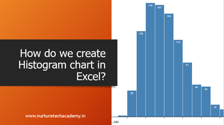
According to Investopedia, “a Histogram is a graphical representation, similar to a bar chart in structure, that organizes a group of data points into user-specified ranges. The histogram condenses a data series into an easily interpreted visual by taking many data points and

423 total views, no views today

Read More
Join our Newsletter

Latest Courses

Excel – Beginner to Advanced (In-depth)

Excel – Beginner to Advanced (In-depth)

₹5,990.00

logo-eduma-the-best-lms-wordpress-theme

(+91) 9899 366 218

info@nurturetechacademy.in

Other

  • Blog
  • Corporate Training
  • Portfolio
  • Contact

Learn MS Excel

Microsoft Excel Learning
Learn MS Excel Online

Corporate Training

Online Corporate Training Programs
Corporate Training Companies in Delhi

Online Training

MS Excel Training Courses
MS Excel Online Training
MS Excel Course Online Training
MS Excel Online Training in Delhi
Join our Newsletter
Why Wait? Start with our awesome Excel updates for free....