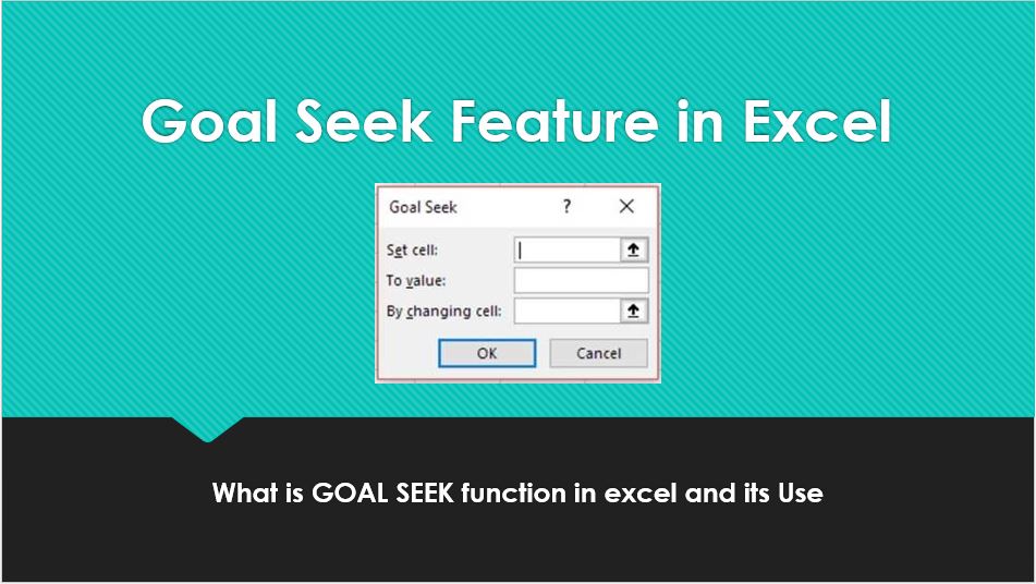
Lokesh Lalwani

Hey there, I am Lokesh Lalwani. I just love Excel and that is why i am here. We founded Nurture Tech Academy with only one goal in mind to make you SUPERHERO in Excel, Yes and that's true. Here at Nurture Tech Academy we work all day and make some impressive Excel Videos, Blog Posts and other stuff just to take you one step closer to become a Smart Excel user.

How to Create a Histogram Chart in Excel

According to Investopedia, “a Histogram is a graphical representation, similar to a bar chart in structure, that organizes a group of data points into user-specified ranges. The histogram condenses a data series into an easily interpreted visual by taking many data points and grouping them into logical ranges or bins”. In other words, Histogram is a type of …

How to Create a Histogram Chart in Excel Read More »

Pareto Chart

Pareto charts are extremely useful for analyzing what problem needs attention first, the taller bars on the chart, which represent frequency and the line shows the cumulative frequency percentage. The Pareto principle (also known as the 80/20 rule), states that, for many events, roughly 80% of the effects come from 20% of the causes. Let’s …

Pareto Chart Read More »