
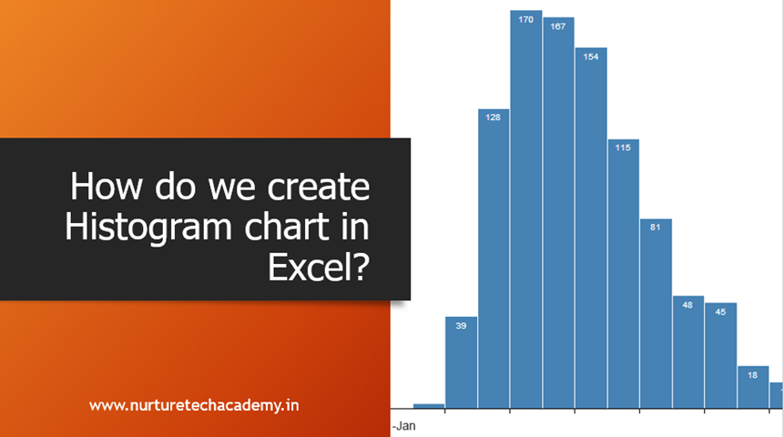
How to Create a Histogram Chart in Excel
According to Investopedia, “a Histogram is a graphical representation, similar to a bar chart in structure, that organizes a group of data points into user-specified ranges. The histogram condenses a data series into an easily interpreted visual by taking many data points and grouping them into logical ranges or bins”.
In other words, Histogram is a type of Column chart which shows the range of data. For example, if we have assigned scores to our sales representatives, on the basis of their sales, then we can create a histogram chart to show how many sales representatives are falling in which score bin e.g. we will be able to know, how many scored less than 40, how many scored in between 40 to 80 and more than 80.
There are a couple of ways to create a histogram-
MS Office 2013 or prior version: We can create histogram chart using “Data Analysis tools” or frequency tool(We will be discussing it in our next blog post).
Ms-office 2016, 2019 or Office 365: This chart type has been inbuilt in the chart group (we will be discussing the same in this blog post).
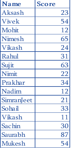
Suppose we have a dataset of our sales team and their scores out of 100.
Steps to create Histogram chart in Office 2016 and upper version:
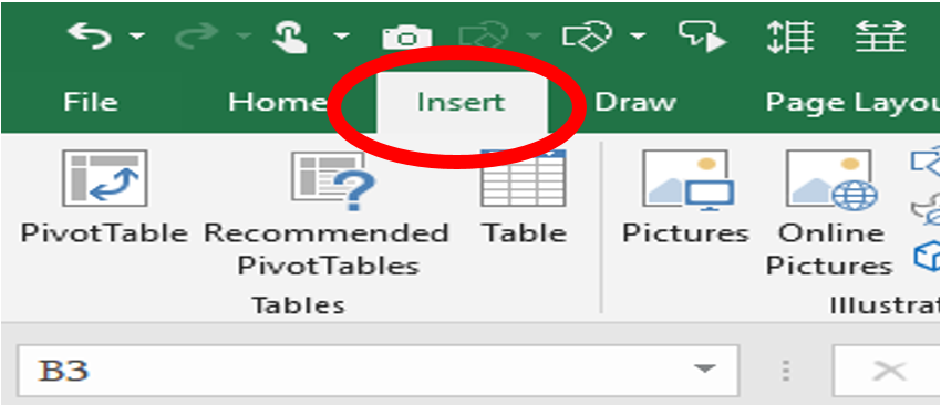
- Select the entire database
- Click on the insert tab
- From the chart group section, select “Insert statistic chart”
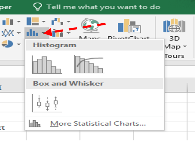
- Select the Histogram chart
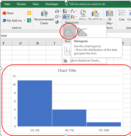
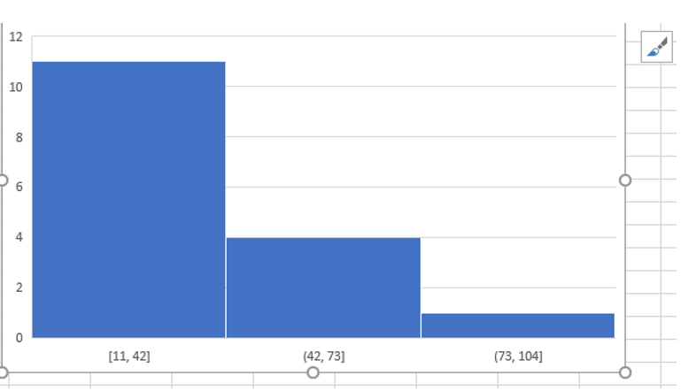
Based on our data set, we would be getting the histogram chart as shown in the above screenshot.
Customization of Chart-
As you may have noticed, the horizontal axis showing some default bins, depending upon the scores in our dataset. Although we can customize the same and much more by following steps-
1- right click on the Horizontal axis
2- select format axis
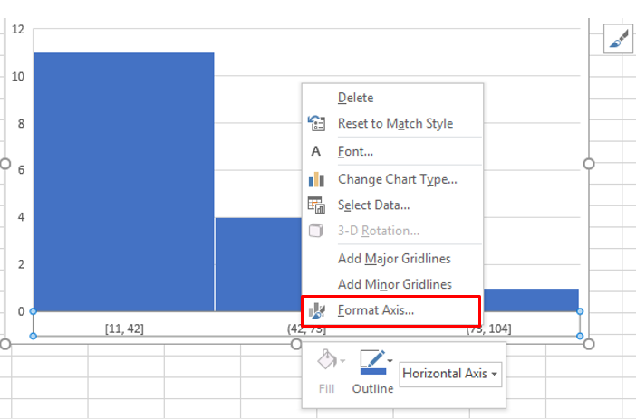
After clicking on this option, we’ll get format Axis pane –
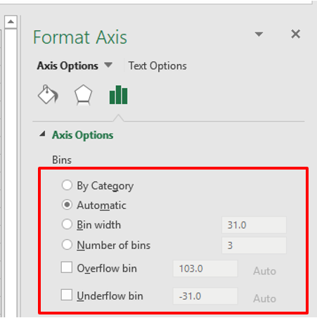
These options will help us to customize our histogram chart. Let’s discuss them one by one-
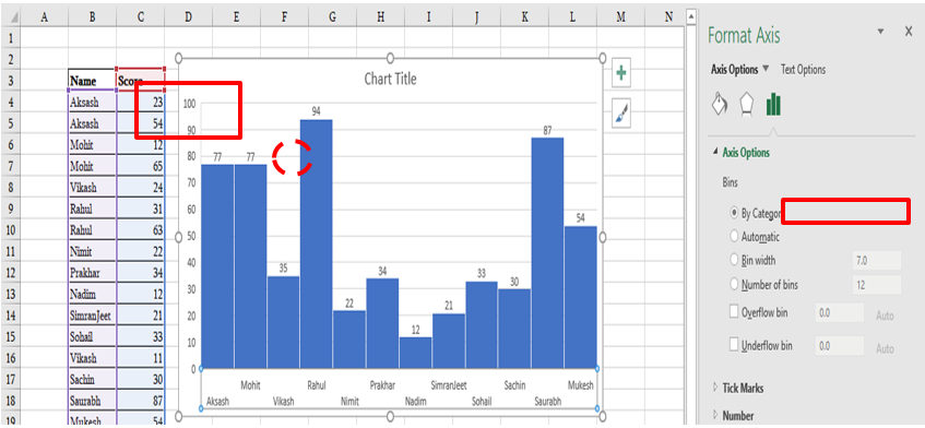
By Category– This will show the name of the categories, which make sense when we are actually dealing with categories like Pen, Pencil, box, eraser etc. but here we have a name of the sales representatives. This will be inappropriate (refer to the screenshot below).
Automatic-This option will automatically decide the total number of bins. For example, according to our dataset, it has taken 4 bins, however, we can change the number of bins according to our requirement.
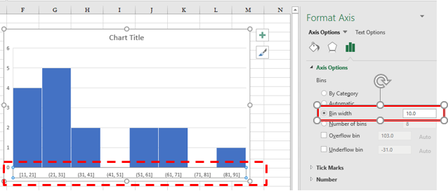
Bin width–
Here we can define the width of the bin. If we put number 10 inside the bin width box, it will create a bin range, which looks like this (11-21,21-31,31-41,51-61 etc.)
Number of Bins– here we can specify the number of bins. Once we change the number of bins, it will automatically create a chart based on the number of bins. In the case of the histogram, we can change either the bin width or the number of bins. Not both.
Overflow Bin–
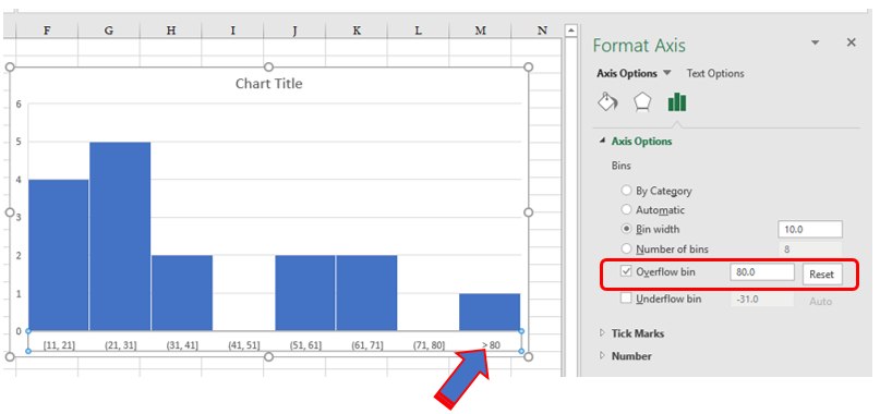
If we want to highlight score >80 on the chart then we can use Overflow bin.
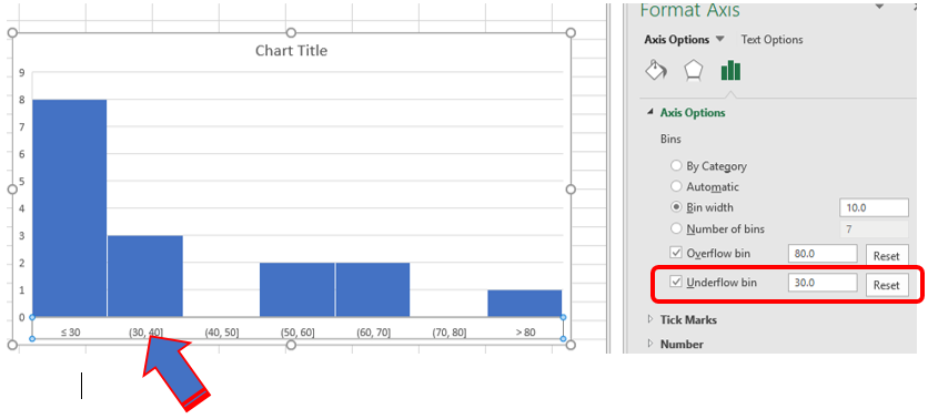
Underflow bin– Similarly to overflow bin, If we want to know the number of the salesperson who scored less than 30 (<30) then we can use underflow bin.
In our next blog, we will discuss “how to create a histogram with Data analysis tool?”.
We hope this blog post will help you to create and customize histogram chart. We would love to hear your suggestions, ideas and how this blog post helped you. If you have any query, feel free to write down in the comment box.
Stay connected and stay updated.
Happy Learning 😊
423 total views, 3 views today
Tag:corporate training companies, corporate training companies in Delhi, corporate training courses, corporate training in delhi, corporate training programs, Easy to use histogram, excel course online, excel courses online, excel online course, excel online training, excel training in delhi, excel training online, Histogram chart, histogram chart example, histogram chart in excel, histogram chart in excel 2013, histogram chart Uses, How to create histogram chart, Learn Histogram, learn microsoft excel, learn ms excel online, learning excel online, learning microsoft excel, microsoft excel course, microsoft excel online training, microsoft excel training, ms excel learning, MS excel online training, ms excel training in delhi, online corporate training, online excel course, online excel training, online excel training courses

You may also like
Heat Map Chart through Radio Button in Excel
27 December, 2018
Count Functions in MS Excel
12 November, 2018
Import Data in Excel using Power Query
2 November, 2018