
Heat Map Chart through Radio Button in Excel
Heat Map Chart through Radio Button in Excel-
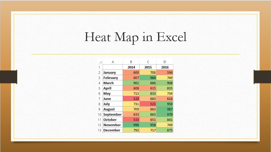
If we wish to highlight Top and bottom values in excel along with colour, rather than finding it manually, simply we will use conditional formatting.
Today we will discuss a different way to highlight Top & Bottom values with radio button along with colours. Are you Excited! Let’s get started.
Before going to start the process, firstly we have to understand-
What is a radio button?
A Radio button allows the user to select an option which updates a report. It’s also called option button.
How to use a radio button?
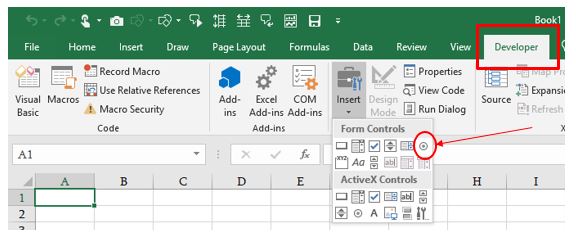
We can get this button under the developer tab. To Add developer tab in excel, follow the steps-
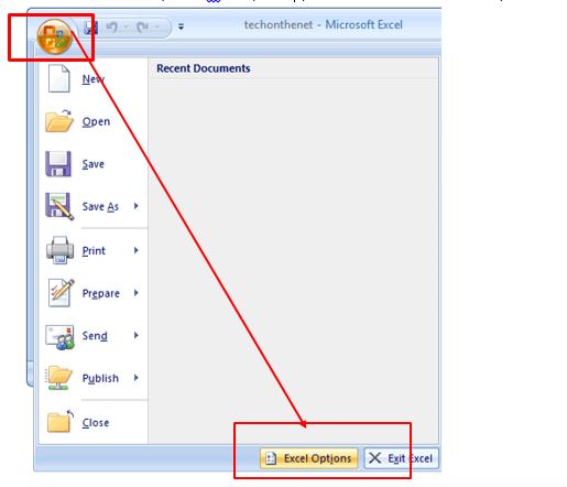
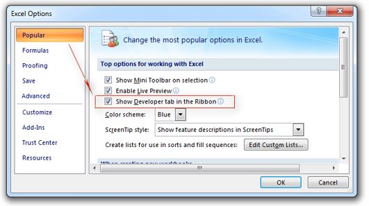
For ms-office 2007-

Office button-> Excel Option-> In the option Popular-> check mark “Show Developer tab in Ribbon”
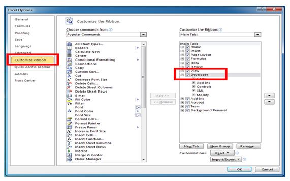
For Ms-Office 2010 or Upper version-
File->Option->customize ribbon -> check mark Developer -> Ok
Go to Ribbon Tab-> Developer tab -> Insert-> Form control –> Select Radio button
Now everything is in order, let’s start the process step by Step-
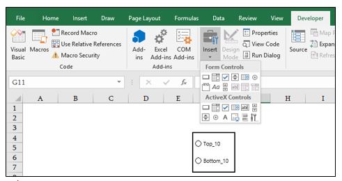
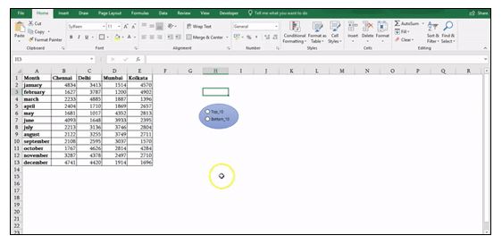
Step1- Insert two radio buttons-
- Developer Tab
- Insert
- Radio button or Option button
- Give them a name (Top_10 and Bottom_10)
Radio Button Properties-
- Right click on a button
- Format control
- Mark on checked
- Select cell address (H2) to create a link with radio button
- Ok
Note: Follow the same process for the next button
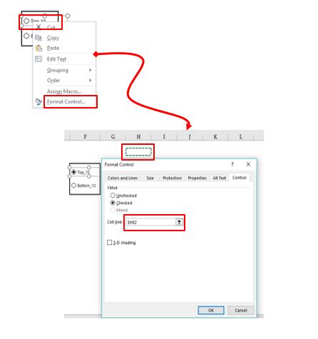
Note: As explained above, we make a link with cell address (H2), when we click on heading Top_10, we can see that Cell address (H2) showing Numerical 1 and when we click on next heading bottom_10, it’s showing 2. Now H2 is behaving like a base cell for both buttons.
Step2-
- Select the data set without headings
- Conditional formatting
- New rule
- Click on “use a formula to determine which cell to format”
- Type this formula
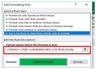
- =IF($H$2=1,IF(B2>LARGE($B$2:$E$13,10),TRUE,FALSE))
- Format-> Fill-> Choose colour
- Ok
This formula visualizes that Top_10, for bottom_10 follow the same process as explain above and apply this formula
–=IF($H$2=2, IF(B2<=SMALL($B$2:$E$13,10),TRUE,FALSE))
Click and choose any button and see the effect.
Follow the process and we can easily apply this effect on any Dashboard or report.
Hope you enjoy this blog post, we would love to hear your suggestion, ideas and if any query feels free to write in the comment box.
Stay connected and Happy Learning 😊
![]()
Tag:chart, chart in excel, corporate training companies, corporate training courses, corporate training in delhi, corporate training programs, excel 2010, excel 2013, excel 2016, excel course online, excel courses online, excel online course, excel online training, excel training in delhi, excel training online, heat map, heat map in excel, learn microsoft excel, learn ms excel online, learning excel online, learning microsoft excel, microsoft excel course, microsoft excel online training, microsoft excel training, MS Excel, ms excel learning, MS excel online training, ms excel training in delhi, Office 365, online corporate training, online excel course, online excel training, online excel training courses

You may also like
How to Create a Histogram Chart in Excel
22 November, 2018
Count Functions in MS Excel
12 November, 2018
Import Data in Excel using Power Query
2 November, 2018