
Pareto Chart

Pareto charts are extremely useful for analyzing what problem needs attention first, the taller bars on the chart, which represent frequency and the line shows the cumulative frequency percentage.
The Pareto principle (also known as the 80/20 rule), states that, for many events, roughly 80% of the effects come from 20% of the causes.
Let’s take an example and understood, how can we create a Pareto chart in Excel?
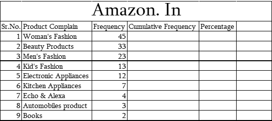
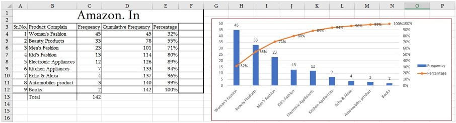
In the screenshot above, we have a product complain database. As per the Pareto principle that 80% of the effects come from 20% of the causes. If we focus on 20% of the major complains then we can reduce the complains number.
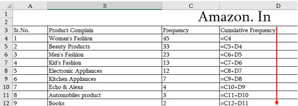
For this, first, we will calculate the cumulative frequency –
- Start with the equal sign (=) and select first frequency ( Ex: value 45) then press enter
- Come to the next cell, again start with the equal sign (=) and select 2nd frequency plus last cumulative frequency value then press enter
- Drag the cell downwards
- Also, check that Last number of (CF) should not be greater than the total value of Frequency
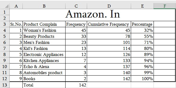
Once we are done with the cumulative frequency, let’s derive the percentage –
= Cumulative Frequency/ (Total of Frequency)
The formula is displayed in the screenshot below:
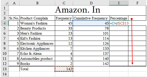
Apply the formula and drag it downwards. (Refer the below screenshot)
How to create a Pareto chart?
- Go to insert Tab
- Select the 2nd column chart
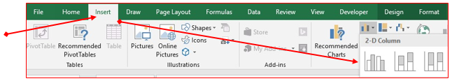
- Insert a blank column chart
- when we insert a chart in our sheet, we get a new tab “Chart Tools” in the Ribbon tab. There are two tabs available further inside the chart tools,
- Design
- Format
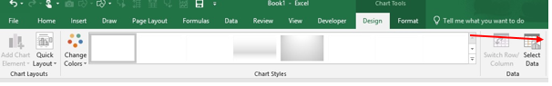
Go to Design tab->> Click on “Select Data”
- Select the range which we want to highlight in charts.
- First, select the product and frequency
- To select another range along with the previous range, put a comma first “,” then select
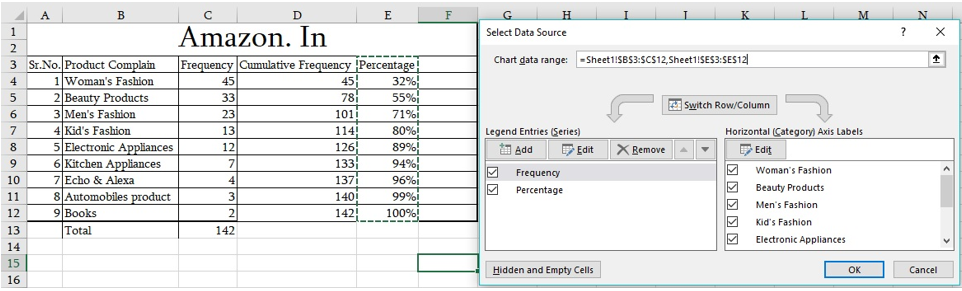
- Click Ok
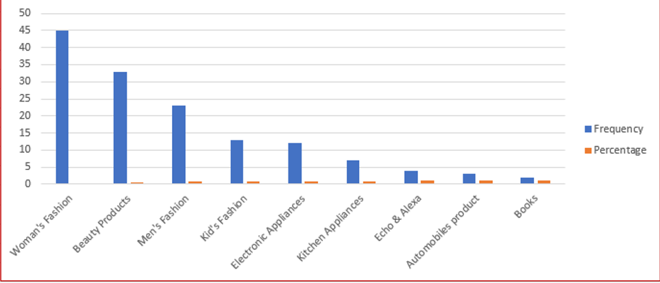
- As per the legend option, Blue colour bars are representing Frequency and orange colour bars are showing the Percentage of Cumulative frequency
- Just click on any one of an orange bar and it will select all by default
- Right click on a selected bar ->> Format data series
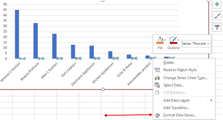
- We get two options-
- Primary
- Secondary
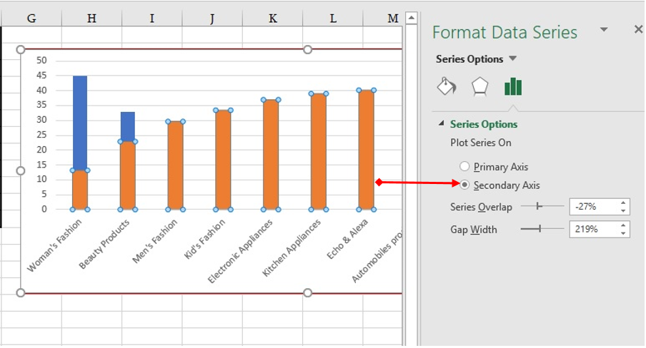
- Mark this Bar as a Secondary->> Design tab-> Change chart type -> Select Line chart
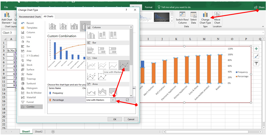
Now, the final chart looks like the one in the screenshot below:

Note: As per the 80/20 principle, first three products are covering 71% complains of all complains.
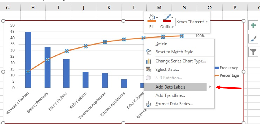
Add Data Labels on the chart-
- Select the Bars
- Right-click -> Add data Labels
Follow the same process for the line chart
Format Axis-
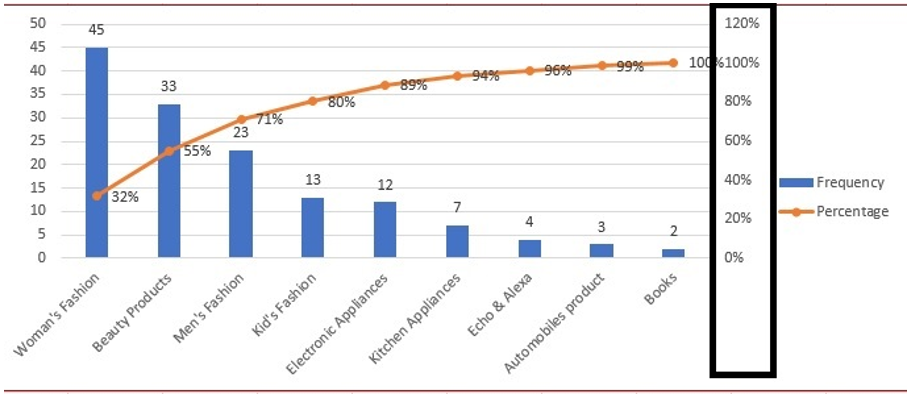
Refer to the highlighted rectangle border in the screenshot above, the percentage is more than 100%. Follow the steps below to correct it out-
- Right-click on the secondary axis
- Format Axis
- Set the maximum value is 1.0
And, the final Pareto chart will look like this-
Hope you enjoyed this post. We would love to hear your thoughts. Do leave your suggestions, feedback, and comments in the comment box.
Happy Learning 😊
252 total views, 9 views today
Tag:corporate training companies, corporate training companies in Delhi, corporate training courses, corporate training in delhi, corporate training programs, excel course online, excel courses online, excel online course, excel online training, excel training in delhi, excel training online, How to use Pareto chart, learn microsoft excel, learn ms excel online, Learn Pareto chart, learning excel online, learning microsoft excel, microsoft excel course, microsoft excel online training, microsoft excel training, ms excel learning, MS excel online training, ms excel training in delhi, online corporate training, online excel course, online excel training, online excel training courses, Pareto chart, What is Pareto chart, What is Pareto chart in Excel, What is Pareto chart in MS Excel

You may also like

Heat Map Chart through Radio Button in Excel
27 December, 2018
How to Create a Histogram Chart in Excel
22 November, 2018
Count Functions in MS Excel
12 November, 2018