
Sparkline Function In MS Excel

How to use Sparkline in Excel?
Charts are the Graphical visualization in excel which help us to understand the weekly, monthly performance and consolidated report of entire data, However if we have a data in to tabular form and we need to visualize our data next to each row and if we apply charts it became very complicated and hard to understand the values. This task can easily be done using “Sparklines”.
Sparkline has been introduced in Office Version 2010. “Sparkline” option is not only limited to “line” but can also show data into “Column” and “Win/Loss”.
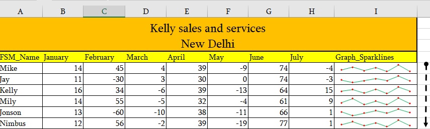
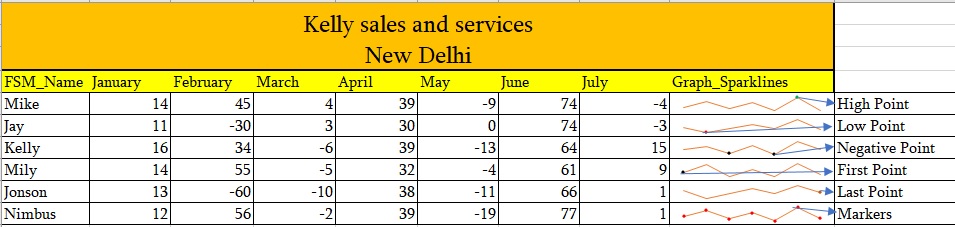
Below screenshot draw exact outcome, what Sparkline can do.
How to apply Sparkline-
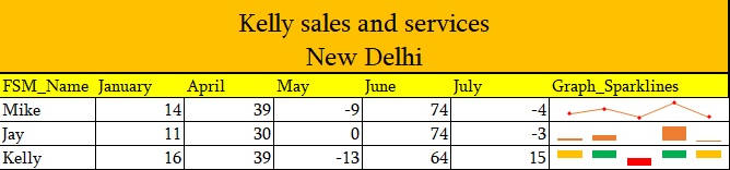
As you can see in above image, we have drawn the monthly performance graph of each and every FSM.
Note: Make sure you are using Ms-office 2010 or upper version.
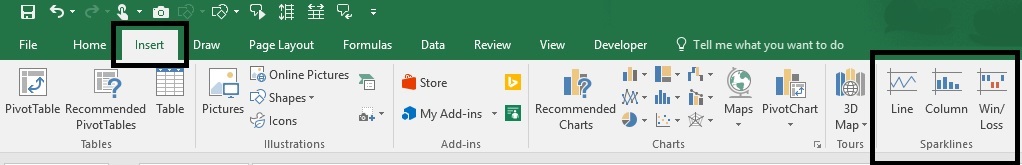
- Go to Insert Tab
- Sparkline group
Select Line, Column, Win/Loss. Here we are using the Line option.
When you click on any “Sparkline” option, it will open a dialogue box “Create Sparklines”. There are two options-
- Data Range- The data range it will use to create “Sparkline”. Select the first range E.g. B5:H5
- Location Range-: The cell where it will insert the “Sparkline”. As it’s asking, “choose where you want to Sparkline’s to be placed” define it E.g. I5
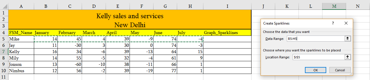
- When you define the range and location. Simply click on Ok
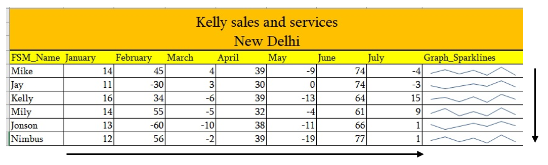
- You will get the Sparkline’s in given range, now just drag it down and you will get Sparklines for all.
Refer the screenshot below-
Formatting of Sparkline’s-
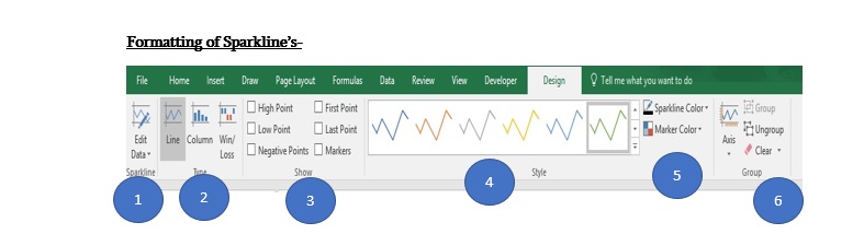
Let’s understand the “Design” tab to format the data:
- Edit Data- Once you have created the Sparkline’s and you want to edit the range, Go to Sparkline’s Design tab and click on Edit data.
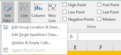
- Edit Group Location & Data– This option will help you to edit both option range and location.
- Edit single Sparkline’s data– This option will help you to edit only range.
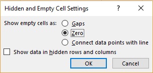
- Hidden & Empty Cells– There are two segments –
- The empty cells– There are three options available.
- Gaps-it will show “gap” for empty cells.
- Zero- you can choose to show zero for empty cells.
- Connect data points with line– to Ignore zero you can directly connect data points with line.
- The empty cells– There are three options available.
- Show data in hidden rows and columns – If you select this option Sparkline’s to hide row and column.
- There are three types of Sparkline’s available, in below mention screenshot you can see all of them-
- Line-
- Column
- Win/Loss
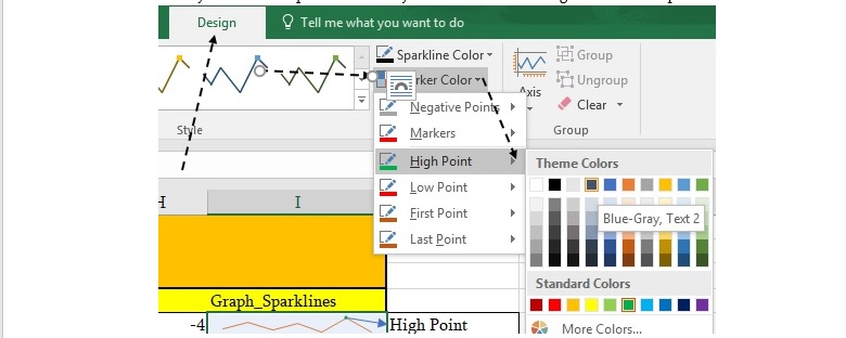
- In the group of “Show”, there are several options which help us to highlight the movement of data-
- High point- if you want to show the high point
- Low Point- this option will helps us to show the minimum point of performance.
- Negative points- to show negative data points.
- First point- it will show the starting point of the data.
- Last point- it will show the ending point of the data.
- Markers- It will mark every data point.
- Style– you can select the different type and colours of Sparkline’s.
- Sparkline’s Colour and Marker Colours – with the helpof these two points, You can modify the view of Sparkline’s. Like you can select and change the colour of points.
- Axis- This section gives you an option to change scaling and visibility details of horizontal and vertical axis of Sparkline.
Types of Sparklines-
- Line- This option draws a simple line. You can change the formatting as explained above.
- Column- These Sparkline’s are displayed in the form of vertical bars. For the positive value bars will be shown above the axis and if any value is negative then it will show below of the axis bar. If any value is zero then it will not show anything on axis bar.
- Win/Loss- These Sparkline’s are displayed in the form of “Column”, however this will be useful when we have positive as well as negative values e.g. profit and loss data. For profit value bar will show on the above of axis bar and for loss it will show below of the axis bar.
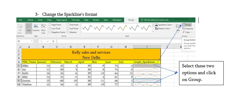
How to Group/ Ungroup Sparkline’s –
If you wish to apply multiple Sparkline’s on your data then you can use option Group.
- Select the more than one cell by holding the control key
- Design tab then click on group
- Change the Sparkline’s format
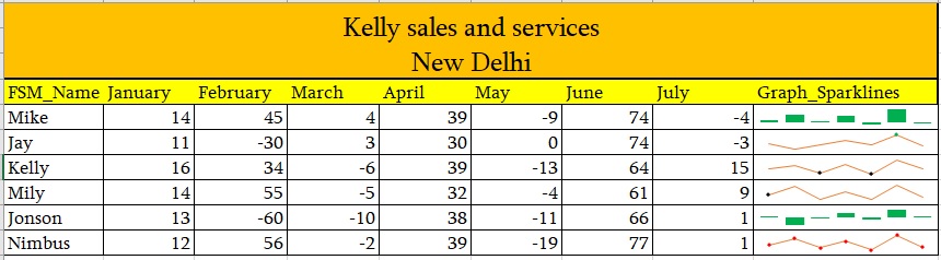
Grouping option gives us the advantage of having different formatting for different groups(refer screenshot below):
Clear Sparkline’s: –
If you wish to remove the Sparklines, go to design tab -> click on clear. You will get two options.
- Clear selected Sparkline’s
- Clear selected Sparkline’s group.
First option will clear the entire Sparkline’s format from the selected cells and second option will clear the Sparkline’s group.
Hope this post will help you to prepare a dynamic report with the help of Sparkline’s.
Stay Connected.
Happy Learning😊
201 total views, 3 views today
Tag:corporate training companies, corporate training companies in Delhi, corporate training courses, corporate training in delhi, corporate training programs, excel course online, excel courses online, excel online course, excel online training, excel training in delhi, excel training online, How can i use sparkline function, How can i use sparkline function in excel, How can we use sparkline function, How to use sparkline function, How to use sparkline function in excel, How to use sparkline function in Microsoft excel, How to use sparkline function in MS excel, learn microsoft excel, learn ms excel online, learning excel online, learning microsoft excel, microsoft excel course, microsoft excel online training, microsoft excel training, ms excel learning, MS excel online training, ms excel training in delhi, online corporate training, online excel course, online excel training, online excel training courses

You may also like

Heat Map Chart through Radio Button in Excel
27 December, 2018
How to Create a Histogram Chart in Excel
22 November, 2018
Count Functions in MS Excel
12 November, 2018