
Waterfall Chart in Excel
Microsoft Excel has lots of predefined charts to visualize the data like Column, Pie, Line etc. In the new version of Ms-office i.e. 2016 or 365, six new charts have been introduced by Microsoft. In this blog post, we are going to discuss one of them i.e. “Waterfall Chart”.
What is the Waterfall Chart in Excel?
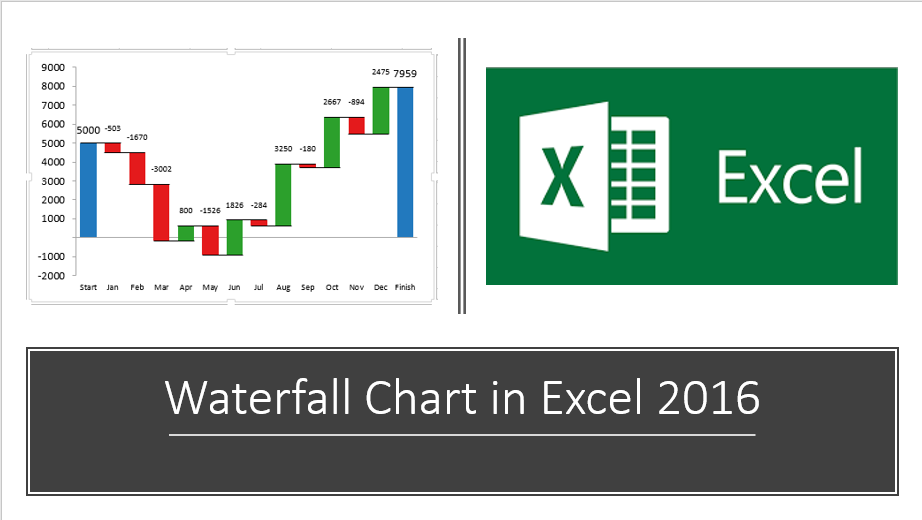
A waterfall chart is an advanced type of Excel column chart which is being used to show the positive and negative values based on starting values.
Let’s see, how waterfall chart looks like-
The first and last column of waterfall chart represents the Total value. The intermediate columns show Positive and negative values in a float. These columns are colour coded for distinguishing positive and negative values.
A waterfall chart is also known as “Excel Bridge Column Chart”, as we can see floating of the columns makes a so-called bridge.
Note: In the Previous Version of Ms-office like 2007, 2010 and 2013, we used to create waterfall chart manually, However, In the latest versions of Ms-office 2016 or Ms-Office 365 this is a given chart type.
How to create a waterfall chart in Excel 2016 or Office 365?
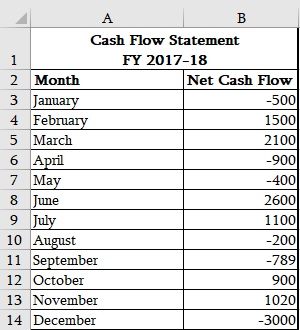
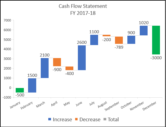
The sample data above has a monthly cash flow statement for the FY 2017-18. Let’s understand how one can convert our data into “Waterfall chart”. Follow the steps-
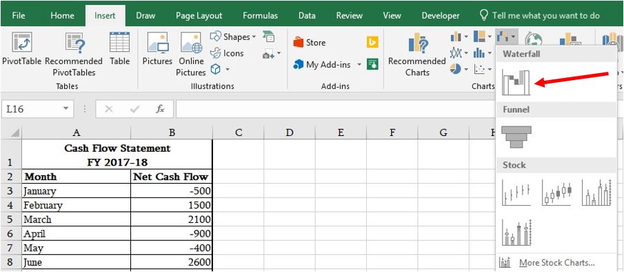
- Select the data
- Go to Insert tab->> select the Waterfall chart from the list
- We will get this chart
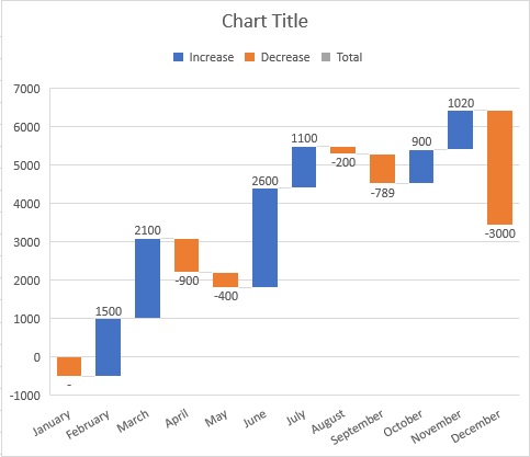
As we can see on the vertical axis, the base value starts from point 0. First month’s value is Negative 500, So, It started with less than zero points and for the next columns it is floating in between the positive and negative values. Isn’t Cool 😊
Formatting of Charts–
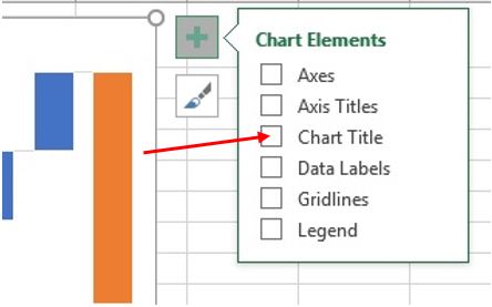
Chart Title- By default, this option will reflect on the top of the chart, however, if it is not there then follow the steps–
- Click on the chart
- Click on plus sign “+” on the top right corner of Waterfall chart
- Checkmark on “Chart Title”
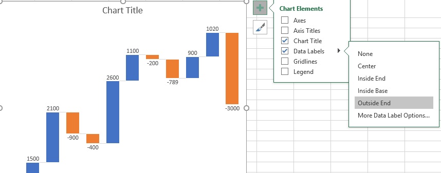
Click on chart Title and write the title Name “Cash Flow Statement FY 2017-18”
Data Labels – we can highlight the value of the column inside end or Base on the columns, Centre or Outside end.
Customising column colores– Let’s show first and last column in a different colour and the different colours for positive and negative values.
- Click twice on the column one would like to change the colour of.
- Right click
- Format chart
- Fill->> choose the desired Colour
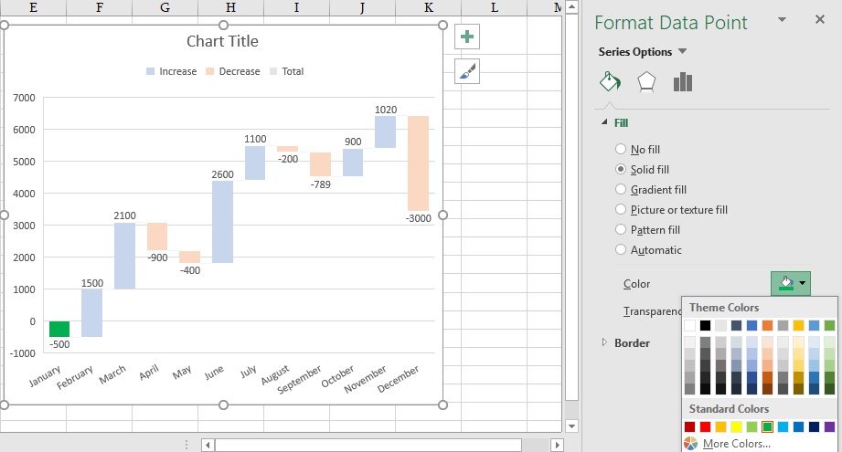
- Follow the same steps, to colour other columns.
Hope you enjoyed this post. If you have any query or suggestions, kindly leave your comment below.
Happy Learning 😊
132 total views, 3 views today
Tag:corporate training companies, corporate training companies in Delhi, corporate training courses, corporate training in delhi, corporate training programs, excel course online, excel courses online, excel online course, excel online training, excel training in delhi, excel training online, how to create waterfall chart, how to visualize data into waterfall chart, learn microsoft excel, learn ms excel online, learning excel online, learning microsoft excel, microsoft excel course, microsoft excel online training, microsoft excel training, ms excel learning, MS excel online training, ms excel training in delhi, online corporate training, online excel course, online excel training, online excel training courses, waterfall chart, waterfall chart in excel, waterfall chart in microsoft Excel, waterfall chart in MS Excel, what is waterfall chart

You may also like

12 Amazing Facts About Excel
12 October, 2018
How to use VLOOKUP with multiple tables
20 April, 2018