Hi All,
Dashboard- Dashboard is one platform that helps management in tracking Performance, evaluation and help them to take a decision based on it. A dashboard is often called a report, however, not all reports are in the dashboard.
Now that we understand what a dashboard is, let’s dive in and learn how to create a dashboard in Excel.
Creating an Excel Dashboard is a multi-step process, once you come to know the idea of what you want to create, next step would get data and create it. If you have a different format of excel file i.e. CSV, Notepad etc. you can easily convert these files into excel. It is a onetime exercise only, where you simply copy and paste the data and it would be automatically updated.
Let’s start with a dummy data which can be download from here.
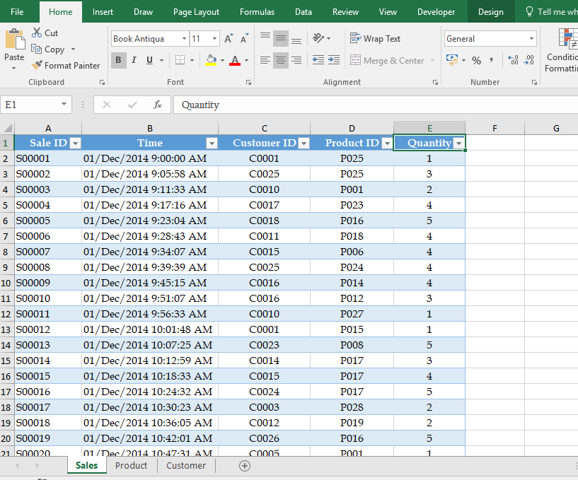
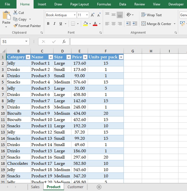
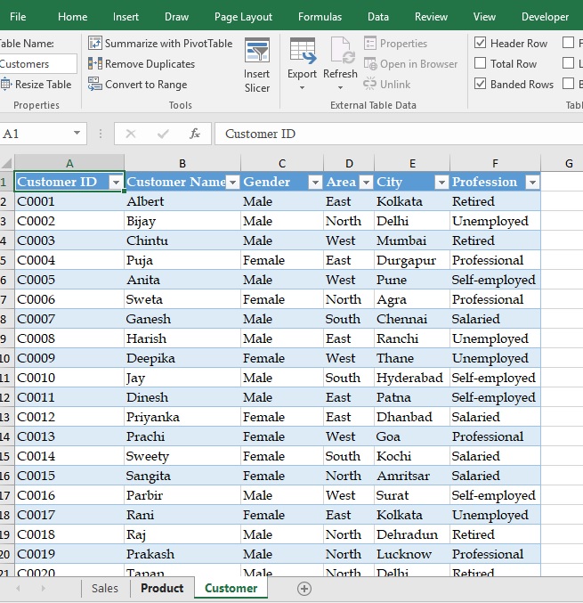
As you can see below we have an Excel workbook in which we are maintaining sales, product and customer data on the different sheets.
In the end, we will create a Sale Dashboard as shown below-
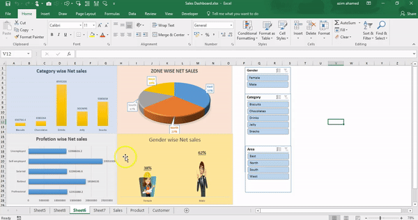
Isn’t cool?
So, let’s get started.
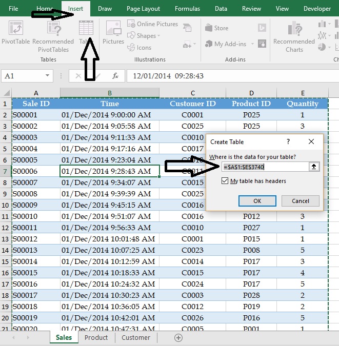
Step1- Firstly Convert your Data into table format-
Put your cursor anywhere on your data->Insert->Table or you can also press a shortcut key Ctrl+T
Note: – Once you click on Table option must be marked on “My table has headers”, if you forget to click, additional column1..column2..will be added on the top of your table.
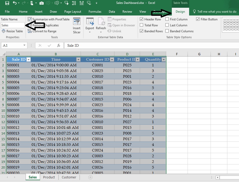
Step2:- When you convert your data into the table format, now you can see there are a “table tools” in ribbon tab in which you have to define your table name.
Table Tools-> Table Name-> Define a Name E.g. Sales
Note: Define table name will help us to identify, which sheet belongs to which name.
For the rest two sheet Follow the same step1 and step2 to convert into the table and define a Name I.e. Product & Customer.
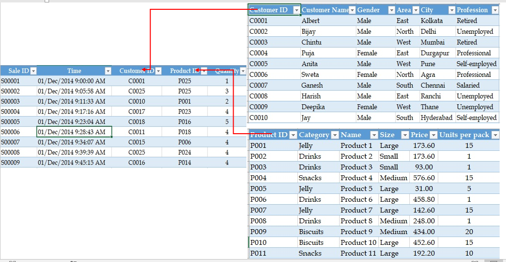
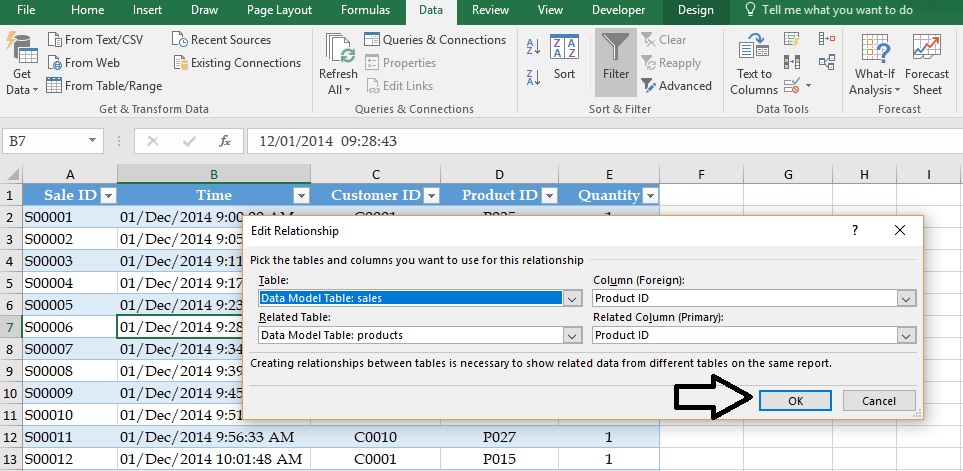
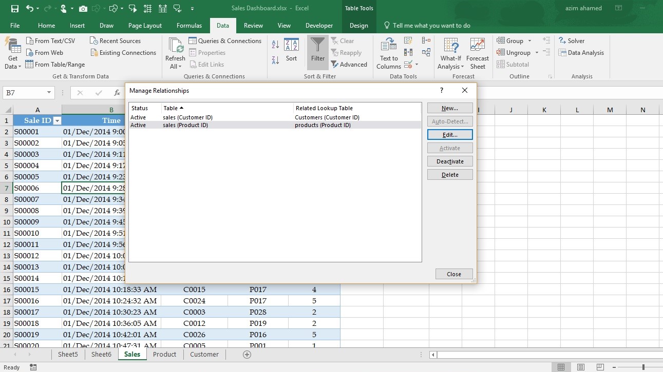
Step3- In this workbook, we need to calculate Total Net sales, so we must build-up a relationship among the sheets, however, we must identify the common heading in between sheets which you can see in below images-
Customer ID reflecting in Sales Sheet and ProductID too, so common sheet will be Sales Sheet.
How to make a relationship between sheets?
Go to Data Tab-> in Data Tools Group -> Relationship
Click on New Tab as shown in below image-
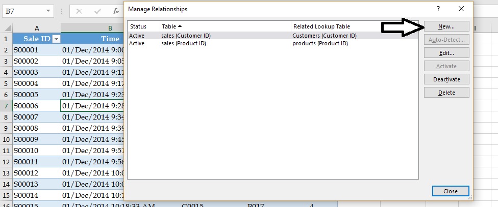
Table box- Select Sales and column(Foreign)- Customer ID
Related Table- Customer sheet and Related column (Primary)- Customer Id
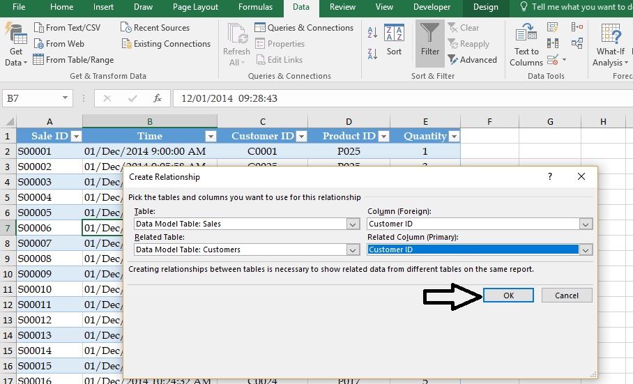
Follow the same as defined in image given below->OK
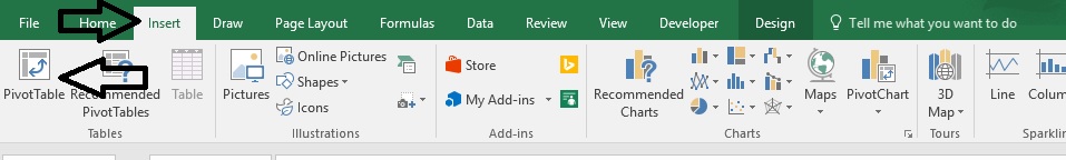
Step4- Upload your data in Pivot table –
How to upload data into pivot table-
Go to -> Insert-> Pivot table or You can press a shortcut key alt+N+V
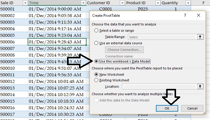
You must have checked on the option” Use this Workbook’s Data Model”.
What is the use of “Use this Workbook’s Data Model”?
A Data Model, a collection of tables with relationships. The data model you see in a workbook in Excel is the same data model you see in the Power Pivot window. Power Pivot is an Excel add-in you can use to perform powerful data analysis and create sophisticated data models. With Power Pivot, you can mash up large volumes of data from various sources, perform information analysis rapidly, and share insights easily-
This option can be used by Ms-office 2013 user or upper. Click and Download the Power Pivot
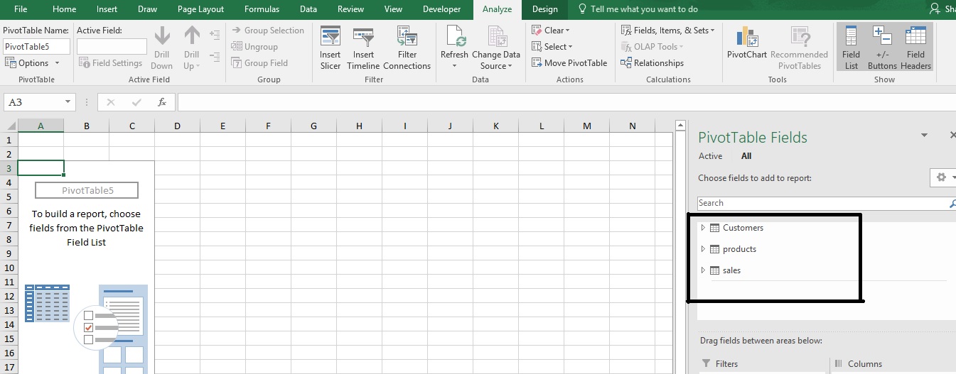
Step5: – with the help of “Data Model” Instead of doing, again and again, it happened at one time, you can see in below image-
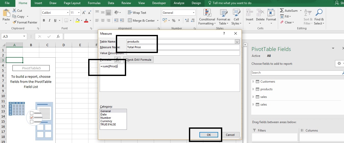
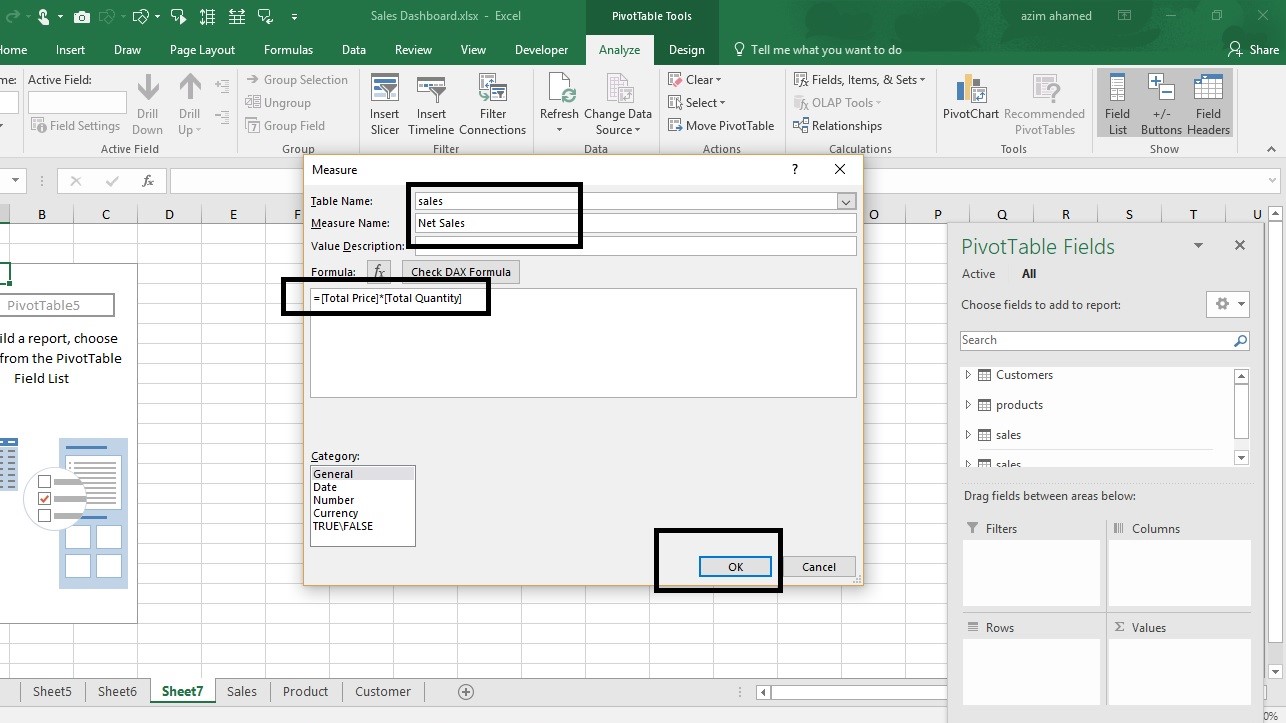
Step 6: – We need to calculate Total Net sales in which we have given Quantity (ref. sales sheet) and Price (ref. Product sheet), so we must calculate Total Quantity, Total Price so that we can easily calculate Net sales.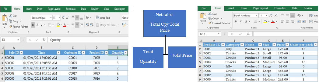
Step7: How to do the calculation in the pivot table?
Right click on data table-> Add Measure
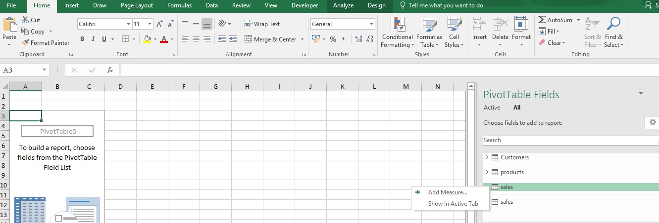
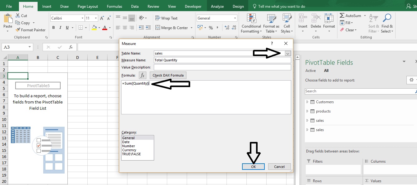
In this window select table name from drop down list i.e. sales-> define Name E.g. Total Quantity -> value description (optional)-> type a formula to add total quantity i.e.=sum([Quantity])-> check DAX formula-> Ok
DAX formula- DAX is a formula language. You can use DAX to define custom calculations for Calculated Columns and for Measures (also known as calculated fields). DAX includes some of the functions used in Excel formulas, and additional functions designed to work with relational data.
Follow the same step6 to calculate Total Quantity and Total Net sales, the reference image is given below-
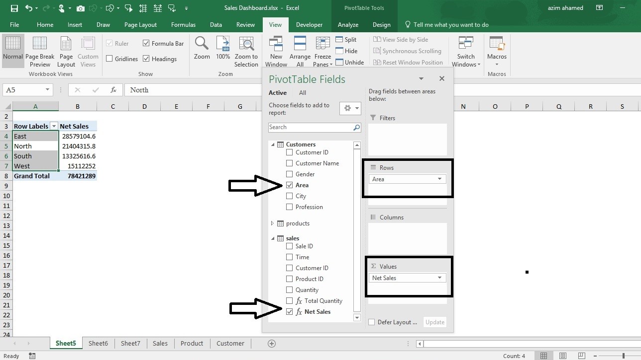
Step8:- Drag fields- The PivotTable Fields pane appears. To get the total amount exported of each product, drag the following fields to the different areas.
- Area to the Rows area
- Net sales to the Values area
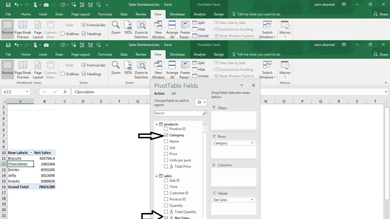
Step9: -Now select your pivot table (Ctrl+Shift+*)-> copy (Ctrl+C)-> Paste (Ctrl+V) –
- Category to Rows Area
- Net sales to Value
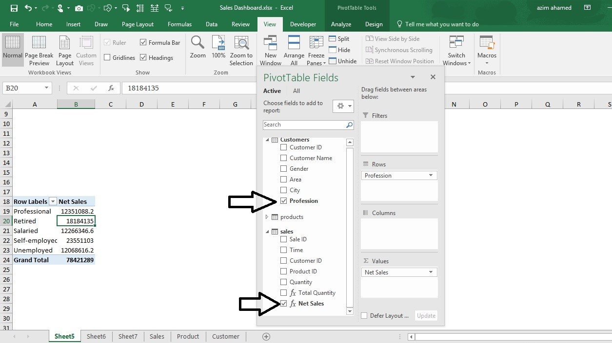
Follow the steps9-
- Profession to Rows area
- Net sales to Value
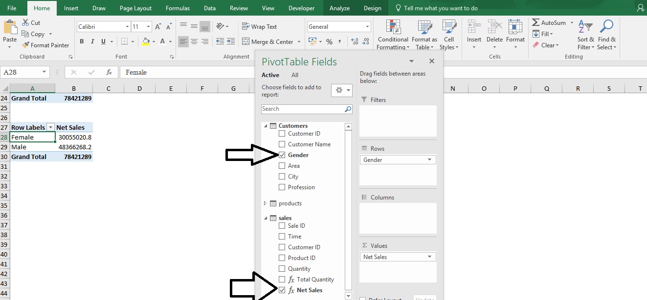
Follow the step9-
- Gender to Rows area
- Net sales to Value area
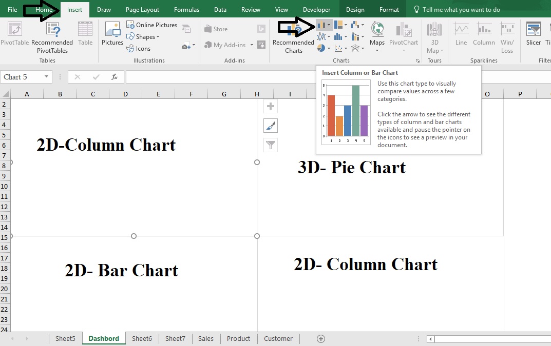
Step10:- Now insert a new sheet and rename it “Dashboard” -> Insert four different blank charts as given below-
How to insert chart?
Insert tab-> charts group -> chart
Step11:- Select chart (2D-Column chart)- Chart tools in ribbon tab->Design Tab-> Select Data-> Click Chart data Range and select the data from sheet5 (Given below)
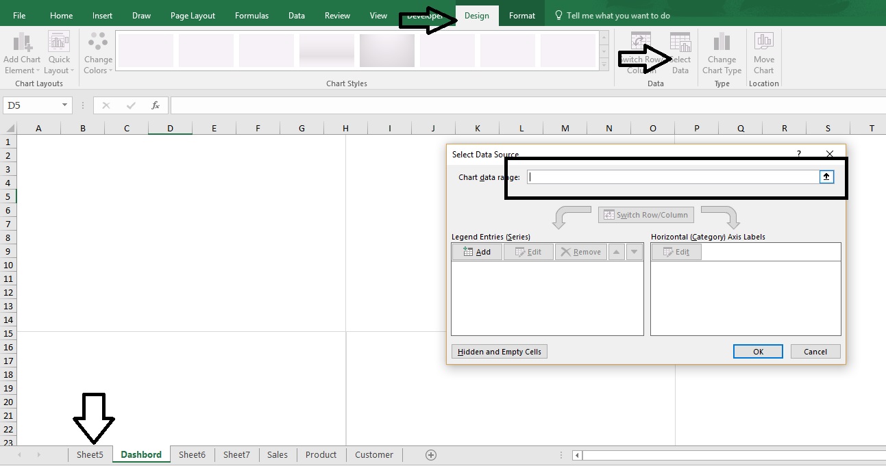
Select the data->
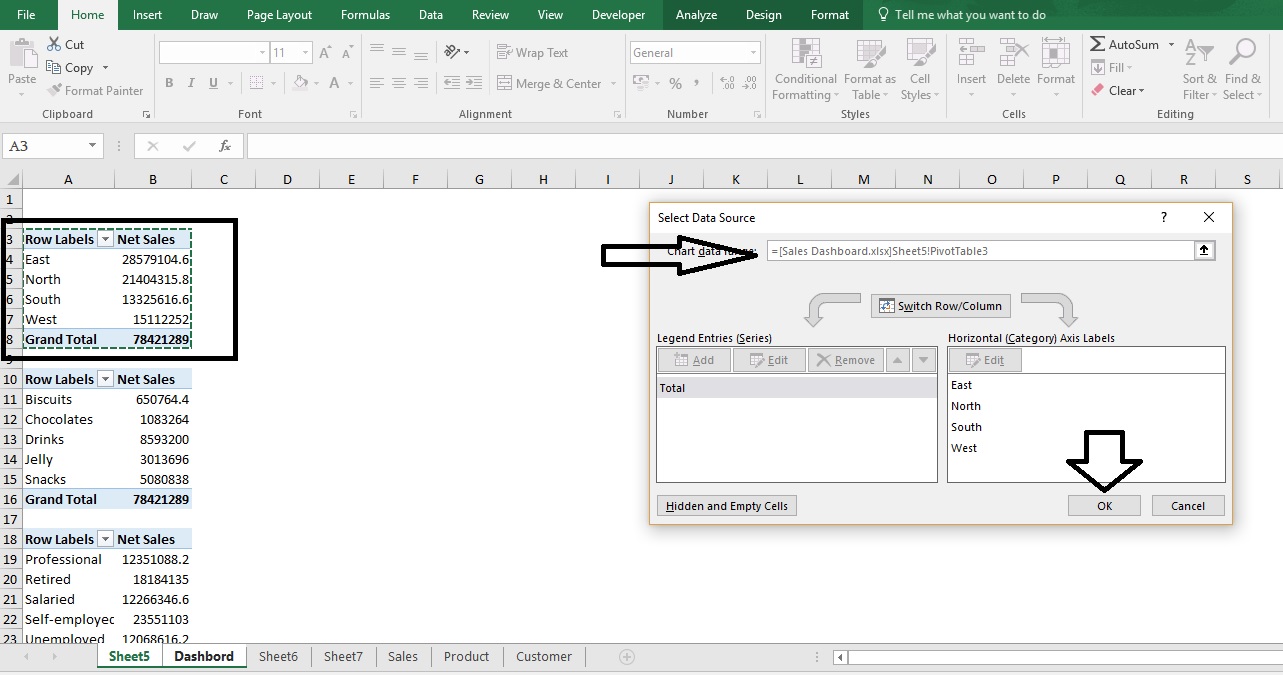
Import data in to chart one by one and create four chart as look like below-
Edit the chart- In ribbon tab chart tools option-> design tab->
- You can apply different chart styles
- You can apply default chart layout
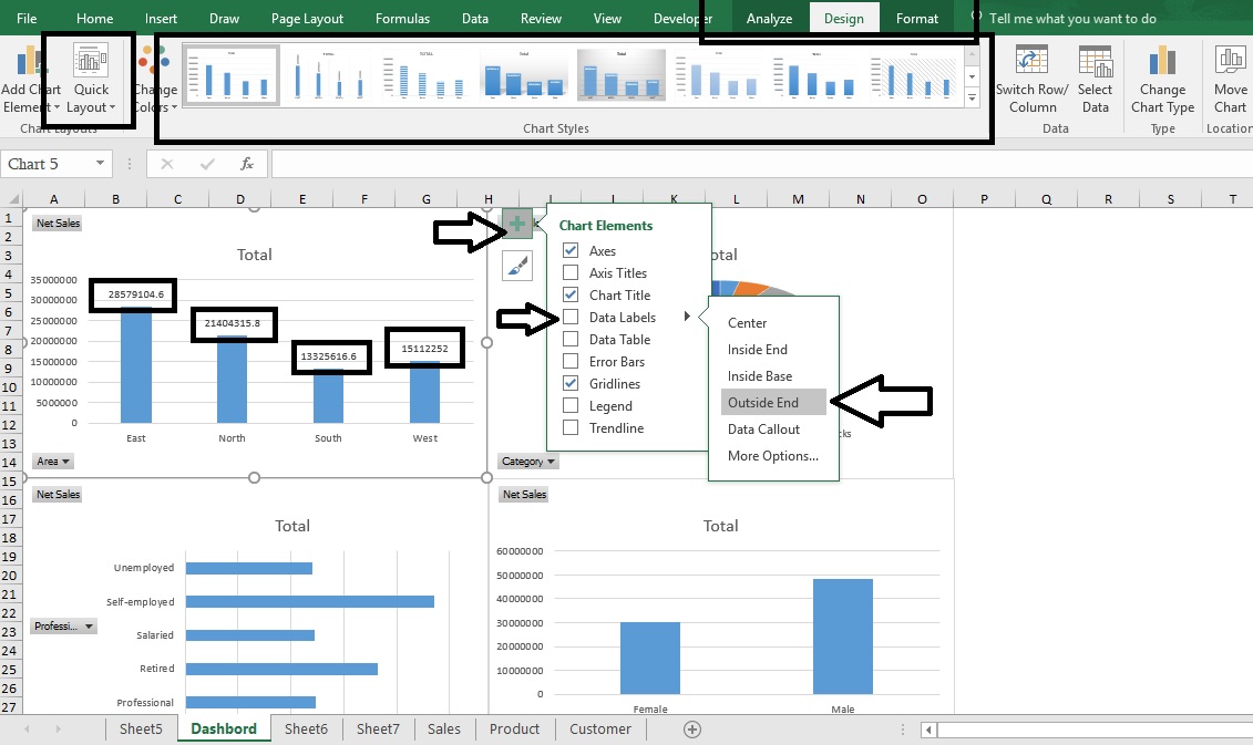
- Right upper corner->”+” ( Called chart elements)-> you can apply Titles, Data Labels, Legend etc.
- Click on format-> apply a color full formatting
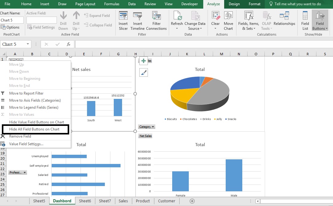
Step12: Also, you can hide Filed button –
Right, click-> Hide all field button on the chart-
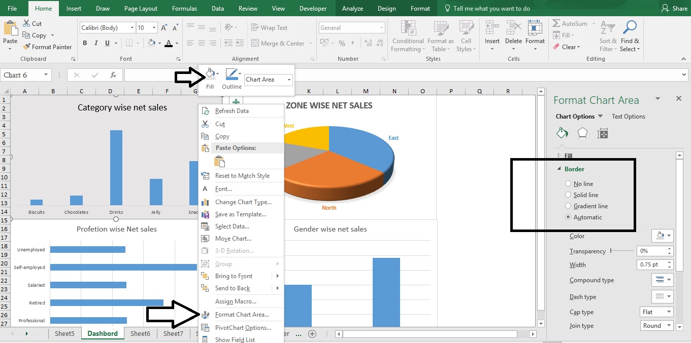
Format your chart- Right click on chart-> Fill option or Format chart area -> you will get a new window right side of your chart and apply chart formatting as you want.
Step13: – How to highlight the image into the chart?
Right, click on chart->Picture-> either you can select from your file or you can directly download it online. See below-
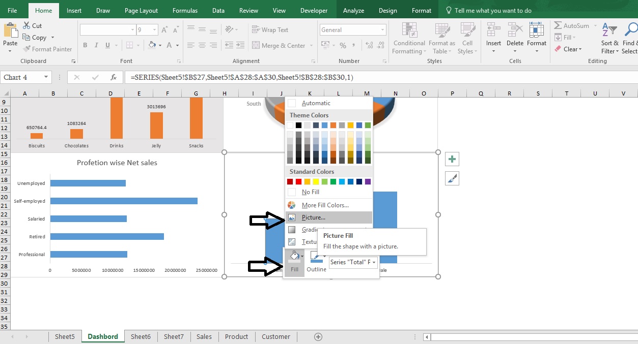
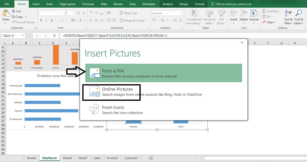
We will find picture online-> Online Pictures-> Search your desire picture-> click on import (see image below)
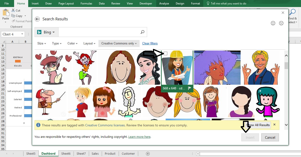
Select picture-> Import
For another image follow the same steps.
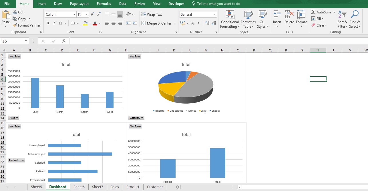
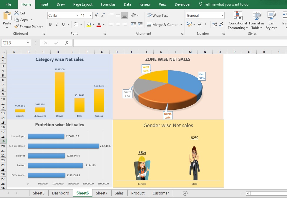
Finally, your dashboard will look like this-
Step14: – Insert Slicer – Slicers provide buttons that you can click to filter table data or PivotTable data. In addition to quick filtering, slicers also indicate the current filtering state, which makes it easy to understand what exactly is shown in a filtered PivotTable.
Chart Tools-> Analyze-> Insert Slicer-> Select the heading which you want to Filter E.g. Area, City, Gender, and Category
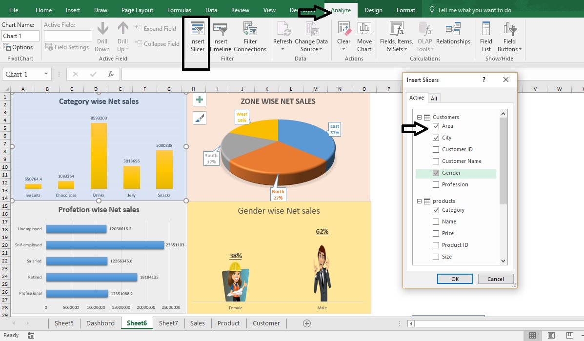
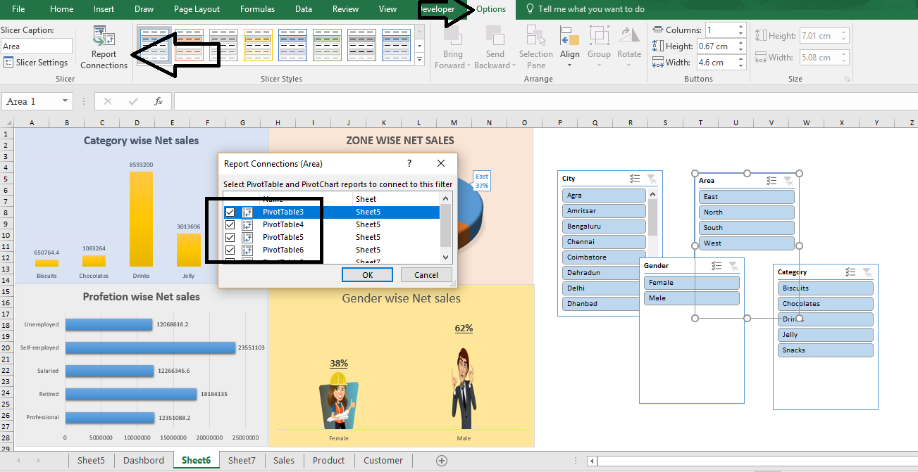
Create a Report connection between slicers -> Slicer-> Option in ribbon tab-> Report connection
Or Right click on slicer and select “Report connection”
Arrange all slicer into one Group-> Select all slicer with holding Ctrl Key-> Format-> Group
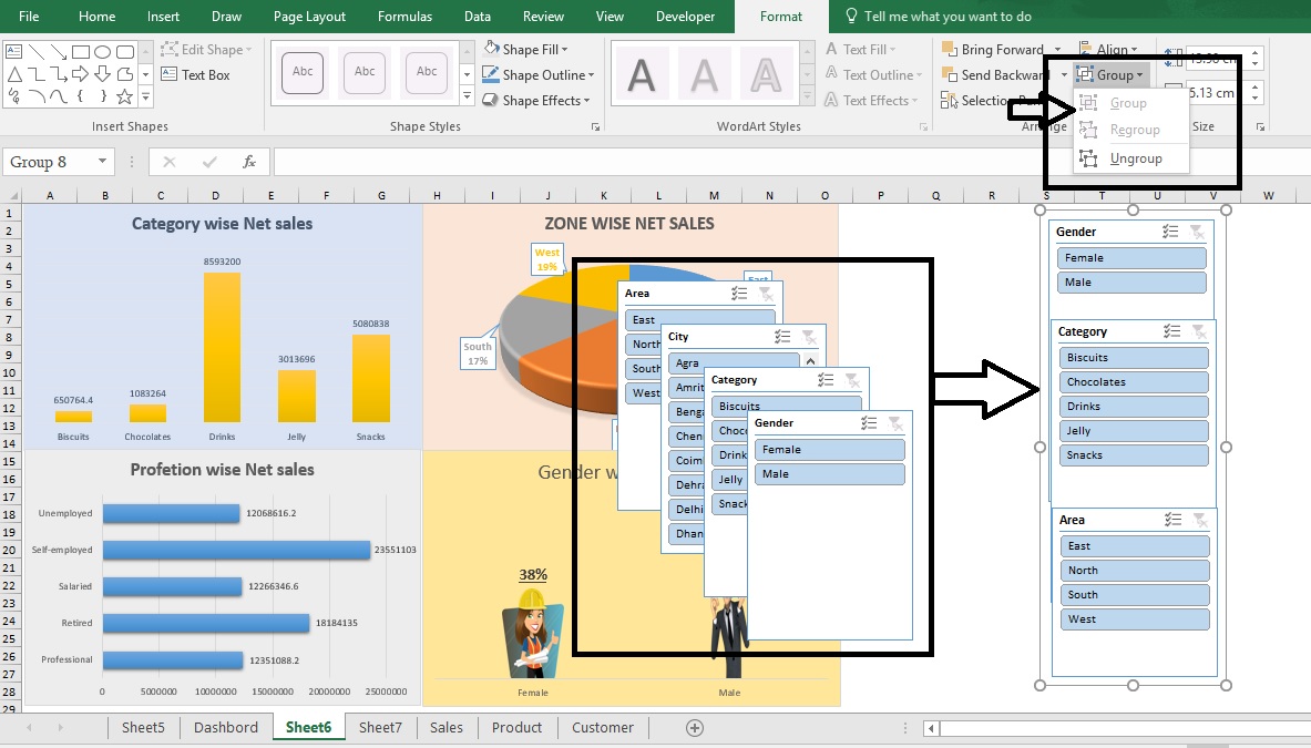
Now your finally Sales Dashboard has been created successfully. In Slicer when you click on any button, you will see chart will update accordingly.
You can download the practice file to click on this link- Sales Data
Happy Learning 🙂
Excellent post. I was checking constantly this blog and I am impressed!
Extremely useful information particularly the last part 🙂
I care for such information much. I was looking for this certain info for a very long time.
Thank you and best of luck.
I pay a quick visit day-to-day some web pages and blogs to read articles, however this
webpage presents feature based articles.
Way cool! Some very valid points! I appreciate you penning this article plus the rest
of the site is also very good.
Very good article. I definitely appreciate this website. Keep it up!